Single Portrait ;
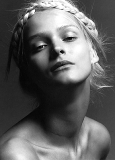
This image was chosen purely on the simplicity and and intrigue on the individual image.
Photographer ; Inez Van Lamsweered And Vin Matadin
Model ; Carmen Kass

I believe that the studio lighting that was use is Rembrandt lighting. This is where a flood light is placed one side of the side of the subject so the shadow from the nose falls across the other side face and meets the shadow on the far side of the face.
http://www.taengo.com/silent/a/Carmen_Kass-11.gif
These are my ideas so far, for the group portrait I will need to discuss.
I am considering 2 ideas/concepts for the group shot:
One will comprise of either the models in flowing dresses with a white/grey background. The lighting used will be short lighting.
The other one will comprise of the theme of jeans as in an add form. The lighting will also use short lighting. (unable to find image, though is posted in my work book)
As for my self portrait I am wanting to be in motion ie. jumping in mid air to show movement. For this concept I will need a big/long backdrop, using a strong light, no diffusers with high ISO/shutter speed.
Will be something similar.
Image taken by Sarah Wilson
With my final results I am slightly happy with them. As it turns out I ended up changing my concepts completely as the original ideas didn't quite work out in the end. Though through doing this I believe that my final ideas/concepts did work out better than originally planned.
I believe that I should have researched the lighting techniques to more of an extent that anticipated, including the photographs that I was going to use as my inspiration.
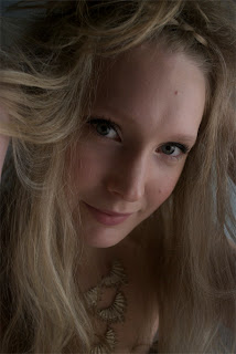
Single Portrait - Elanna Woods
 With the original concept, I found that it wasn't working as there wasn't enough light and wasn't quite sure how the lighting was set up. Having that said I had some help fr om class mates and Arata to try and get the lighting right, though in the end I found it more visually captivating to have a close up of Elanna whilst having her face lit and allowing her hair to fill the space around her.
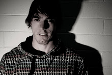
Self Portrait - Dylan O'Halloran


I image was one of two that I was torn between, in the end it came down to this one as it looks more natural[image on right]. Where the image below looks more posed
Group Portrait - Geneveve Duck, Hayley Kiermaier, Sarah Wilson and Amanda Smith.
This idea was chosen on last minute as I felt the first concept wasn't going to workout. I believed that, without the knowledge of how to properly shoot fashion photography it wasn't going to work out. As the image above is more or a glamour fashion photograph rather than a portrait.
Image taken by Sarah Wilson
With my final results I am slightly happy with them. As it turns out I ended up changing my concepts completely as the original ideas didn't quite work out in the end. Though through doing this I believe that my final ideas/concepts did work out better than originally planned.
I believe that I should have researched the lighting techniques to more of an extent that anticipated, including the photographs that I was going to use as my inspiration.
Single Portrait - Elanna Woods
 With the original concept, I found that it wasn't working as there wasn't enough light and wasn't quite sure how the lighting was set up. Having that said I had some help fr om class mates and Arata to try and get the lighting right, though in the end I found it more visually captivating to have a close up of Elanna whilst having her face lit and allowing her hair to fill the space around her.
Self Portrait - Dylan O'Halloran


I image was one of two that I was torn between, in the end it came down to this one as it looks more natural[image on right]. Where the image below looks more posed
Group Portrait - Geneveve Duck, Hayley Kiermaier, Sarah Wilson and Amanda Smith.
This idea was chosen on last minute as I felt the first concept wasn't going to workout. I believed that, without the knowledge of how to properly shoot fashion photography it wasn't going to work out. As the image above is more or a glamour fashion photograph rather than a portrait.


Please show me your workbook, cheers.
ReplyDeleteArata